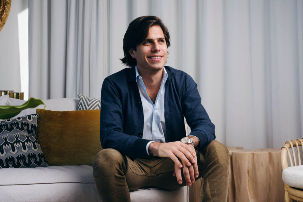
10 Questions With… James Hirschfeld of Paperless Post
James Hirschfeld founded Paperless Post with his sister, Alexa, in 2009, when he realized he needed a contemporary way to plan his 21st birthday party. Since then, the company has revolutionized the digital invitation market—and invited everyone to join in on the fun, from stationary experts, like Crane, to designers, like Jonathan Adler and Monique Lhuillier, not to mention Paddington Bear. Here, Hirschfeld sits down with Interior Design to talk skeumorphism, artificial intelligence, and a new collaboration with Milan-based textile brand Lisa Corti, celebrating its 60th anniversary this year.
Editor’s note: This conversation that has been edited and condensed for clarity.
The Making Paperless Post with James Hirschfeld
Interior Design: What’s the origin story of Paperless Post?
James Hirschfeld: It really was born out of a design vision. I was born in 1986, and in my lifetime, I saw communication become digitized. Everything moved from physical mail to digital mail, from my college acceptance letter to business email. But by the time I was 21, I saw that one kind of communication hadn’t really moved online: the communication around important life moments. Stationary was really big, but I saw that eventually it would probably move online, too. And digital media was in a kind of vacuum of design, with web 2.0 and Facebook and Twitter taking off. Everybody felt like the internet was about user-generated content and functionality. It was hard to create beautiful images in a browser, and it was harder to download beautiful images in that browser. There was just a pervasive feeling that the web was not a place for beauty.
ID: When did beauty first become important to you?
JH: As a young child, I was obsessed with collecting coins and stamps. It wasn’t about the history, or the regimes that were putting them out. It was about the images, the illustrations, the culture and aesthetics. I was in college when I was first starting Paperless Post, at Harvard, and I was in a club there where the walls were covered in, like, 200 years of posters created by amateur artists. The illustrations could communicate something as subtle as words but not with words, through color and gesture and line. At the time, most people didn’t have access to Photoshop and Illustrator and InDesign. So I thought: Why don’t we make a platform where a normal consumer can go into the browser and design an invitation for an event that matters to them that’s actually really beautiful, that they feel proud of?
ID: What were the early design principals you developed?
JH: They were simple, and they were the aesthetics of print. Skeumorphic, which is probably a bit of a dirty word today. But I really wanted senders and receivers alike to have that feeling of when you go into your mailbox and there’s that one envelope that’s thick and has a nice hand-feel to it. The user experience that followed was based on the experience of customizing stationary: it was very textured, and there were typesetting tools. You could customize the inside and outside of the envelope. We didn’t use tons of color because even if you were doing an expensive letterpress process, you’d never have more than five colors on it. As we launched, people began to get the idea that this is not a webpage for your event, it’s not an evite. It’s an invitation you get through the internet. And once they got that, we were able to be a bit more expansive about the way we think about good design for the product.
ID: How so?
JH: At first, we followed stationary trends, where you were seeing a move toward full-color illustration. Then we opened up to start working with collaborators. But a big change was when we launched Flyer, which broke from skeumorphism and embraced digital aesthetics. It created a canvas for users to create something that wasn’t even necessarily beautiful, but was expressive and fun with gifs, photographs, and video. It embraced the aesthetic of the Internet and allowed users to remix it. The special part of the experience is having an event and saying: This is my party, and this is how I want you to see me.
ID: That makes me wonder: How do you know how many tools to give the user, and how complicated they should be?
JH: Well, the landscape of creativity tools has changed incredibly since we started. There were basically no browser-based design experiences, and now you can use the whole Adobe suite on your iPhone. And then there’s AI, which is wild and kind of mind-blowing in terms of the amount of possibilities in creating images. So all that has encouraged us to offer more and more tooling, and to create high-impact features that advanced users can use. But while it’s great when professional designers use us, we’re really thinking of helping the average consumer make something they’re proud of, which means powerful tools but also really helpful defaults and settings, beautiful proprietary assets in fonts and illustrations that people can riff off.
ID: When did you first bring in collaborators?
JH: As I got into this world and began thinking about product, I had my own heroes. Kate and Andy Spade had an approach to stationary that was kind of whimsical but also postmodern and conceptual. They would, like, foil stamp Cheerios onto a birth announcement. That was really cool. Rebecca Schmidt Ruebensaal’s Mr. Boddington’s Studio had a great voice in stationary. I think other people might be like: Okay, that’s cool, how do we do our version of it? And I thought, I don’t really want to copy them. I want to work with them. And that’s how we started to collaborate.
ID: How did you begin working with interior designers?
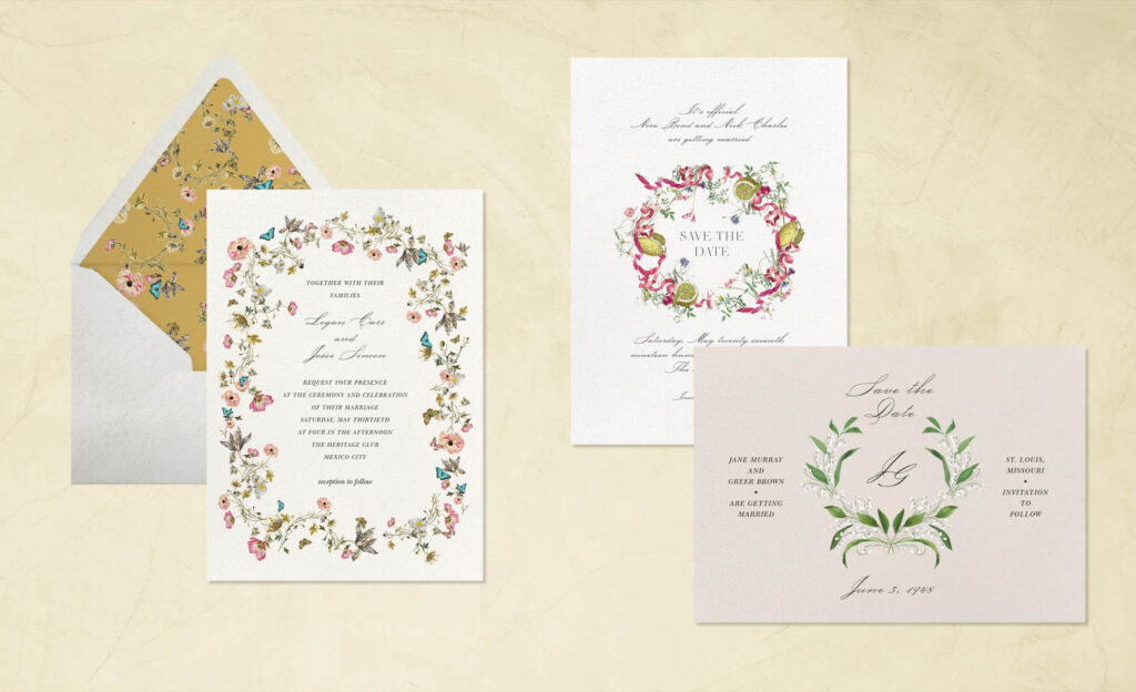
JH: In the end, stationary is pretty simple, generally just a rectangular two-dimensional plane. We realized it would be fun to see how someone like Kelly Wearstler would do it, coming from a world where she’s thinking about environments. Another early collaborator was John Derian, and that was a fun stepping stone because his world is totally about paper. He goes around the world finding beauty in old paper and then reproducing and cutting it up to make new things. It was interesting to translate that to a digital product. We’ve done great collabs with interiors companies like Schumacher and Jonathan Adler. One of the nicest ways people experience their homes is when they’re entertaining, so this is kind of going a half-step from that, the way you present yourself as host and style your party. And that led to fashion companies like Oscar de la Renta. It was exciting to explore, from a partnership angle, designers who have great prints, or how to capture the essence of the cut or a drape of a dress.
ID: Which brings us to the new collaboration with Lisa Corti. How did that come about?
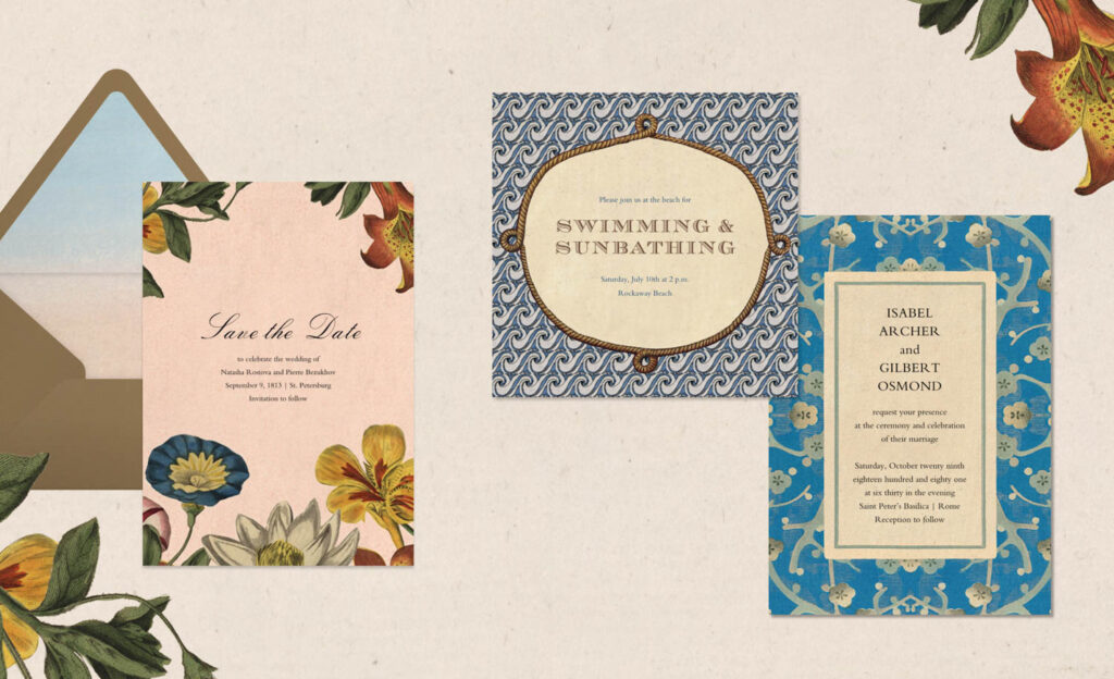
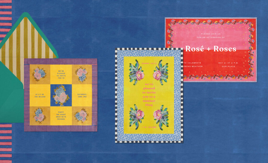
JH: A couple years ago, I was at my friend’s mother’s house in Bridgehampton [New York]. Her mother has incredible taste, and I look up to her a lot. Her kitchen is a very old-school kitchen, with a big round table, and on the table was the most cool tablecloth I’ve ever seen. It was mustardy yellow with this deep burgundy stripe and had a flower in the middle of it. Clearly, it was block printed, and it just really stuck with me. It’s a look at, once you see it, you kind of know it when you see it, and I started to see them at different people’s houses and began learning about the brand.
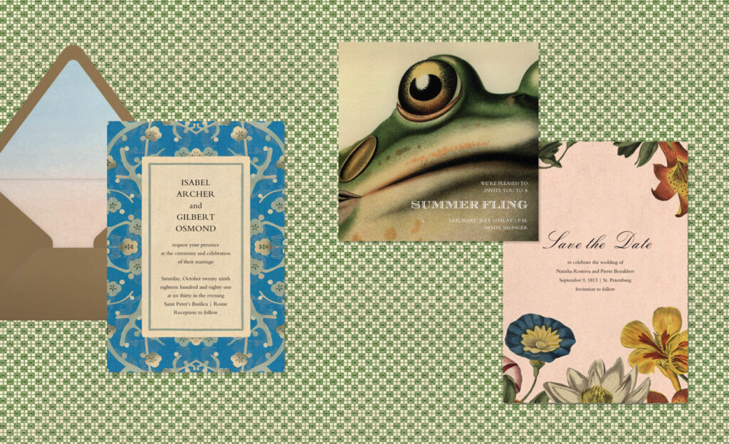
A few years ago, I wanted to do a summertime launch of a collection that would speak to a kind of Mediterranean, outdoor living experience. Tablecloths kind of look like invitations in the sense that they’re rectangles with incredible graphics on them, so I thought it was easy to see how this could work. I love how everything they do is hand block-printed. You never see a flat color; you can see where the repeat is, and where the distribution of the dye is uneven. It was important to me that it came through, even in thumbnail sizes.
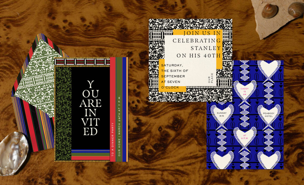
ID: Was that kind of bold patterning what inspired the collaboration with Duro Olowu?
JH: He’s an amazing fashion designer and works a lot with referencing textile traditions. As a curator, he brought such a vision to the pattern and color, but he was also so delighted to see the ways our team reworked them and integrated text in creative ways. I think it’s a magical moment in collaboration when a tablecloth becomes an invitation—when a text gets integrated into the design. That’s always really fun to be on the phone call when the designer says: Wait a second, I would never have thought to do the graphic design that way.
ID: What’s next for Paperless Post?
JH: I’m very interested in figuring out how to best incorporate AI into the product on many different levels. On the design side, I think it could be an empowering for people to edit and create something that is really just for them, and is coming out of their own vision. I’m very much looking into how embrace that as part of our toolset. And we’ve also decided to create a product that is tailored to the needs of people having events at work, which has been interesting on the design side. Businesses have to operate within their own brand guidelines and they sometimes want to be polished, but not too expressive. So how do you create exceptional design for them? It’s interesting, because Paperless Post is a technology company serving hundreds of millions of users. But, at its core, it’s a design company.
More Invitations by Paperless Post
read more

DesignWire
10 Questions With… Gio Pastori
Milanese designer Gio Pastori creates a visual identity for Salone del Mobile 2023, with a graphic alphabet illustrating how to speak design.
DesignWire
Behind Alda Ly Architecture’s New Furniture Design Venture
Alda Ly and her minority-owned, majority-women firm bring their effervescent, human-centric vision to furniture showroom design for the first time.
Products
Liz Lambert’s New Outdoor Textiles Serve Up Southwestern Style
Liz Lambert fills her Far West collection of outdoor textiles with colorful sarape stripes and soft textures, made with Perennials’ UV-resistant acrylic.


recent stories
DesignWire
Cooper Hewitt Unveils 2023 National Design Awards Winners
Cooper Hewitt, Smithsonian Design Museum recently announced the winners of the 2023 National Design Awards, honoring design innovation and impact.
DesignWire
Milo Kleinberg, Trailblazing Founder of MKDA, Dies at 97
MKDA founder Milo Kleinberg, a trailblazer in the realm of workplace design, died recently in his home in Riverdale, New York, at the age of 97.
DesignWire
10 Questions With… Ceramicist Jane Yang D’Haene
Jane Yang D’Haene pushes the limits of clay through her ceramics work, crafting art and furniture that reflect tradition through a contemporary lens.